I Reviewed 50 Startup Pitch Decks. Here’s What They Keep Getting Wrong.
Founders consistently make the same mistakes in pitch decks. Hopefully this helps fix them.
About a month ago, I asked founders to send me their pitch decks. I reviewed all submissions, with a focus on early stage startups from ideation to seed / seed+.
My feedback is summarized below, including common breakdowns and most common advice. If you’re building a deck for your pre-seed or early seed round, these patterns matter.
The most consistent issues?
Design that hurts credibility instead of building it
A total absence of story — just slides, no arc
No real traction, or zero evidence of demand
Try out Pitch Deck Reviewer GPT!
For fun, I built a GPT trained on all the feedback I gave and my experience working with hundreds of founders. Give it a try!
Let’s walk through what to fix, and how to do it better.
1. Your Design Is Hurting You
In 93% of the decks I reviewed, the design was working against the founders.
Some were plain to the point of looking abandoned. Others were chaotic messes of fonts, colors and layout experiments gone wrong. A few looked like someone gave PowerPoint to a raccoon.
Design doesn't need to be fancy. It needs to be clean, clear and confident. It needs to show you care.
How to fix it:
Use consistent fonts and spacing.
Simplify color use (with high contrast).
Align things. Really.
Focus each slide on one key point with fewer design elements.
Get rid of outdated icons, pixelated logos and off-brand visuals.
Minimize the use of AI generated images / visuals, especially as filler.
Don’t use messy screenshots as visuals. They confuse more than help.
If design isn’t your strength, hire someone. It’s worth it.
You're asking someone to write a $500K check. A sloppy deck says, "I don't sweat the details."
Investors see hundreds (if not thousands) of decks per year, great design will help you stand out.
Here’s a deck that’s pretty well designed:
2. Most Decks Forget They're Telling a Story
A pitch deck isn't an array of disjointed slides. It’s not a list of facts. It's a narrative. You have to tell a story and get people emotionally invested.
My recommended format: Hearts — Minds — Wallets.
First, make the audience care.
Then, help them understand, rationally.
Finally, give them a reason to believe this is worth betting on.
This framework is the backbone of great storytelling. It gives your deck rhythm. It builds emotional momentum. It lets people feel the weight of the problem, grasp the logic of the solution and want to see it in the world.
Too many decks skip that. They string together slides like a checklist: problem, feature set, TAM, business model, team, ask. But there’s no pulse. No cohesion. No narrative friction pulling the reader forward.
How to fix it:
Open with pain: something visceral, something urgent. Get people emotionally invested in the problem. Even “boring problems” can be powerful.
Don’t jump to the solution and what the product does right away. Focus on the value it creates. What gets better? Faster? Cheaper? If you can’t articulate value it usually means you don’t understand the customer well enough.
Don’t wait 12 slides to talk traction. If you've got proof, bring it forward.
Don’t assume the story tells itself. Spell it out. Structure it.
You have seconds to grab an investor’s attention, how will you pull it off? Usually this is done by highlighting the problem, but in some cases it may be the market size or traction or something else. Shock me. Tell me something I don’t know. Not all stories start exactly the same way.
3. Bad Slides Kill Momentum
Some slides are dead weight. They either try too hard, say too little, or confuse the reader entirely.
Top offenders:
Slides crammed with text, numbers, or jargon that are often better suited for an appendix; beware of acronyms—you’re assuming the audience understands them (and they might not)
Confusing diagrams that don’t help the story (they actually make things harder to understand)
Market sizing slides built on fuzzy math with no sourcing
Business model tables with six tiers of pricing and no clarity on how you actually make money
Product visuals that raise more questions than they answer
Competitive matrices with axes no one understands
One slide had so much tiny text packed in, it felt like reading the fine print on a pharmaceutical label.
How to fix it:
Trim copy by half. Then trim again. If you’re sending a deck before a meeting, add enough text so there’s context and the narrative is clear. But investors won’t read multiple paragraphs per slide.
Don’t fear white space. Crowded slides feel anxious. Put dense detail in the appendix.
If a diagram doesn’t help me grasp something faster, it doesn’t belong. But visuals are your friend if you get them right. Hire someone to help you with this if necessary.
Avoid dumping raw data. Instead, highlight insights. One powerful stat beats a table of noise.
Break complex ideas into two slides instead of one overloaded one.
Headline every slide with the one takeaway I should remember. A strong headline isn’t a label, it’s a point of view. Say: “We reduce fraud by 90%,” not “Product Overview.” Generic headlines are a waste of space and opportunity to make a key point (especially when they take up 1/3rd of the slide).
4. You Can’t Be Everything to Everyone
Some decks tried selling to five personas across three continents. With two business models. And a sprinkle of AI, just in case. Always a sprinkle of AI… 😆
Ambition is good. But lack of focus is fatal. Investors aren’t looking for proof that you’ve mapped out every possible future. They’re looking for conviction about where you’re starting.
Startups don’t win by doing everything. They win by doing one thing well, for one user, with one sharp wedge into the market.
Anchor yourself:
Who’s your wedge? What’s your beachhead?
Why is that the best starting point?
What makes this narrow slice urgent, underserved, or strategically valuable?
A scattered deck makes it feel like you haven’t validated anything deeply. A focused one builds confidence you’ll actually get something off the ground (even if you pivot later).
How to fix it:
Pick one target user and build the story around them.
Choose the sharpest, most painful use case, not the “bigger” but more generic one.
Move other personas, verticals & geographies to a “future expansion” slide or appendix.
Simplify your GTM to match: one user, one motion, one channel.
If you’re still figuring this out, that’s OK; but don’t pitch breadth as strategy.
You don’t get extra credit for optionality. You get funded for focus.
5. Where’s the Proof?
You can have a beautiful solution. A massive market. A perfect founding team. It doesn’t matter if you can’t prove people want what you’re selling.
Traction doesn’t have to mean revenue. But it has to mean something:
Beta users
LOIs
Waitlists
Conversion rates
A pilot with a real name attached
These aren’t nice-to-haves. They prove you’re not just imagining demand.
How to fix it:
If you’re post-launch or have even one live user, lead with it. Make it visual. Highlight logos, quotes, outcomes…anything real.
If you’re pre-launch or pre-product, you still need momentum that feels like traction:
Talk to customers:“We spoke with 25 creators across MENA. 80% said they’d try this tomorrow.”
Build a credible waitlist: “200 signups in 2 weeks from cold outreach. No ads.”
Get soft commitments: LOIs, letters of intent, emails confirming intent to use.
Show signal density, such as engagement on a prototype, response rate from outreach, or demo interest.
If you’re too early for traction, show obsession. Show urgency. Show you’re out talking to people. Show a repeatable story that ends in interest, not indifference.
Your job is to prove that someone wants what you’re building (or planning to build).
Here are some decent examples:
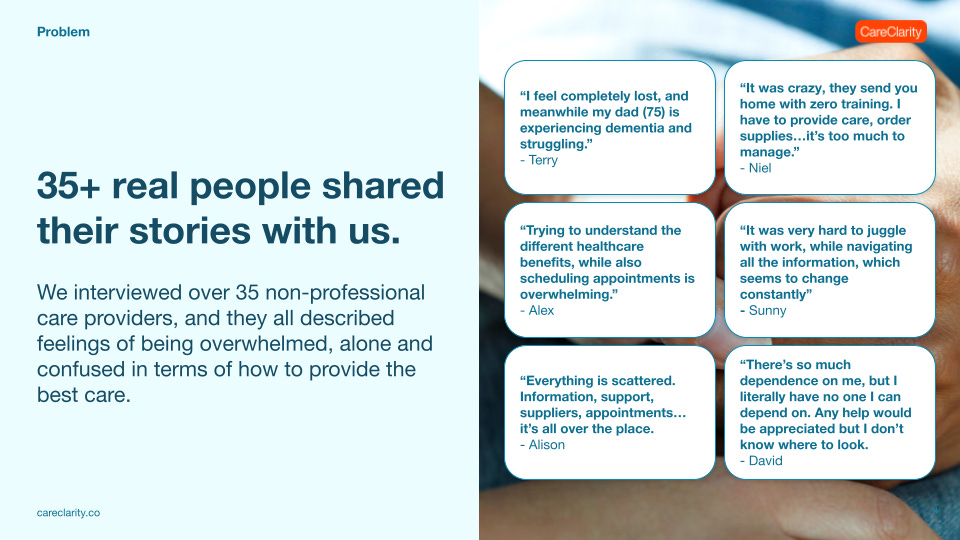
This was a deck we prepared at Highline Beta for a concept called CareClarity. We hadn’t built anything yet, but were focused on early validation (“traction”):
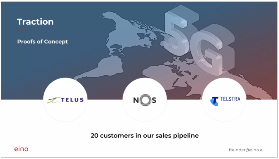
Eino raised a $150k pre-seed round showing they’d done a few POCs (with well-known brands) and had a robust sales pipeline (I’d want to know how legitimate that pipeline is):
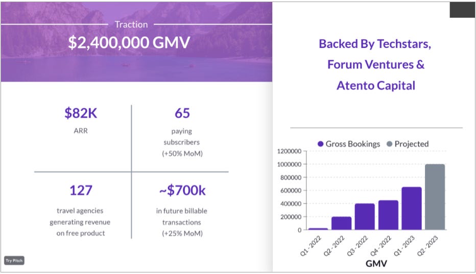
SquadTrip raised a $1.5M seed round with this traction slide (adding previous investors is smart):
6. The Missing Slide That Screams Urgency: “Why Now?”
This one keeps showing up half-baked, or not at all. In fact, 75% of the decks I reviewed didn’t include it.
Founders say things like: “We live in a digital-first world.”
Sigh. You need to tell me something I don’t know!
If the opportunity’s been around for years, what changed? What unlocks it now?
Timing is a wedge. If you don’t make the timing feel urgent, your idea feels optional.
What Makes a GOOD “Why Now?” Slide:
Specificity that points to a concrete shift: regulation, platform change, behavior spike, tech unlock.
Relevance that’s directly tied to your product or market wedge.
Time-bounded, suggesting a window of opportunity (and that it won’t stay open forever).
Non-obvious—go beyond generic macro trends (e.g. “e-commerce is growing”).
Feels fresh, showing that now is the first time this idea is truly viable.
Good examples I’ve seen:
“Apple’s iOS changes finally make this distribution channel possible.”
“OpenAI’s latest release unlocked capabilities that made this MVP buildable in 30 days.”
“New financial regulations allow lenders to access this borrower segment for the first time.”
What Makes a BAD “Why Now?” Slide:
Generic mega-trends like “AI is hot,” “millennials love convenience,” or “remote work is on the rise.”
No link to your specific solution.
Vague claims like “the world is changing fast.”
Statements that have been true for a decade (which is the opposite of urgency).
A “Why Now?” slide should feel like you’ve caught a wave, not that you noticed the ocean exists.
How to fix it:
Make sure you have a “Why Now?” slide, ideally placed right after your solution or traction slides.
Look for sharp shifts, not slow-moving trends. Shocks. Triggers. Tectonic movements.
Tie the timing to your wedge. The best “Why Now?” slides make it clear that this product, in this form, only makes sense now.
Use evidence if possible. Chart a growth spike. Quote a policy. Reference a competitor’s failure. Make it real.
Avoid filler phrases. If you can paste your “Why Now?” slide into any other deck, it’s not specific enough.
Your timing is part of your moat. Make the opportunity feel like it’s right now, not five years ago or five years from now.
7. The GTM Slide Isn’t Optional
About 40% of the decks either skipped the go-to-market (GTM) plan entirely or phoned it in. That’s a huge mistake. Investors need to believe you know how to reach your customers and that your plan is rooted in reality, not marketing buzzwords.
Here are some of the common problems I saw:
No GTM slide at all. If you’re not showing how you’ll grow, you’re asking investors to make a huge leap of faith.
Empty strategy. Slides said things like: “social media,” “word of mouth,” “influencer marketing,” or “paid acquisition”—without any numbers, sequencing, or rationale. That’s not a strategy. That’s a list of buzzwords.
No prioritization or sequencing. Some decks dumped a list of 5-6 channels. That doesn’t show focus, it shows you don’t yet know what will work (which is OK, but pick a lane). GTM is about narrowing down and testing hypotheses, not covering all possible options.
How to fix it:
Include a dedicated GTM slide. Even if you’re pre-launch. Especially if you’re B2C. Make it early in the deck, right after the product section or problem-solution. Don’t bury it.
Show your starting wedge. Be specific about what you’re doing first. What channel are you testing? What signals are you seeing? Who is your early adopter and how are you reaching them?
Include learnings, not just plans. If you’ve run ads, cold outreach, landing pages, waitlists, etc. then show the data. Even if a test/experiment failed, that’s a signal you’re iterating. Investors want to see that you’ve touched the market, not just theorized.
Keep it simple and sharp. What’s your wedge into the market? What channels have signal? Where are you doubling down? One slide. Clear focus. Some traction or clear hypotheses. That’s enough.
8. Easy Fixes That Shouldn't Still Be Issues
Details matter. Unfortunately, a lot of founders don’t sweat the details to the extent that I think is important. Quite often there were little mistakes that threw everything off. Here are the things I flagged again and again:
Typos and grammar issues. More than a third of the decks had them. That’s avoidable. Ask someone to review before you send out the deck. These mistakes jump off the page and don’t reflect well.
Missing contact info. Your first slide should include your name and email. Don't make people hunt. If someone wants to follow up and can’t find you, you’ve already lost.
Hashtags on title slides. A few decks used hashtags throughout. It didn’t add anything. Skip it.
Section divider slides. You don’t need a slide that just says "TEAM" in big font. Transitions should be seamless, not announced.
Exit strategy slides. There’s no point, it’s fantasy at this stage.
Weak closing slides. Many decks end with a simple “Thank you” slide. Meh. The final slide should hit hard. Mission. Vision. Future. Make the last thing people see/read something they remember.
Clean decks signal competence. Cluttered decks signal chaos.
9. What the Best Decks Got Right
Some decks hit hard. Here’s what they did:
Told a story with a beginning, middle and punchy end
Focused on the problem and made me feel the pain
Front-loaded traction
Used clear, human language (minimal buzzwords and acronyms)
Kept design minimal, confident and clean
Explained GTM like they’d actually spoken to customers
Made me believe they were the ones to pull this off
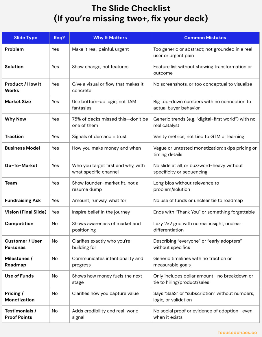
Here’s a summary slide checklist. If you’re missing two or more of these slides, fix it.
Your deck has 1 job: make people say, “I want to learn more now!”
Being great at creating pitch decks translates to other places where you’re pitching: sales, business development and partnerships.
You don’t need 40 slides. You need ~15 good ones. You don’t need to be flashy. You need to be clear. Sweat the details. And if you can make people care, you’ve already won half the battle.



Last night as I was reviewing my 24th revision of a pitch deck & came across your page "I Reviewed 50 Startup Pitch Decks. Here’s What They Keep Getting Wrong." and then the GPT. The GPT was fabulously helpful. I have an instinct to complicate things - this was the anondyne and the pitch went great.